
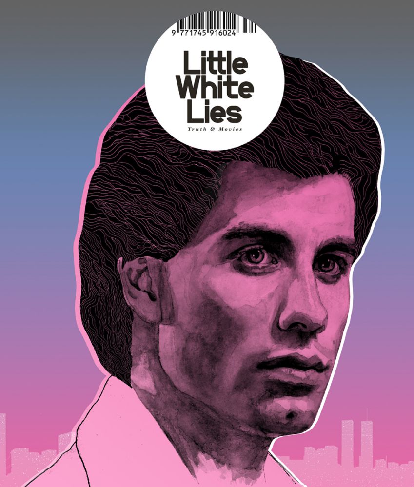
Thursday 20 December 2012
Final Magazine cover
Wednesday 19 December 2012
Producing the magazine
Below I will be documenting the process of our magazine, it was a very long process but we managed to do it all in the end:

The first step was to choose our photograph and use the quick selection tool to select the image and remove it from the unwanted background.

Before placing the image we first had to choose the background that we wanted. We chose a brick background in order to give it a rough feel. We then edited the background with a cartoon, artistic feel similar to the ones seen on Little White Lies. We also added an effect to the image of Tommy before we placed it onto the background.

We then placed the image onto the background and cropped it into place.


We then added the title 'Motion.' We used the effects button in order to play around with the drop shadow and outer glow of the text.

We added in the bar-code and circle design similarly to the Little White Lies using the shape tool. Then we made the text smaller so that they could fit together.

We then added in the rest of the text making sure to stick to magazine conventions that we have already looked at.

We did a sight test of the magazine to see if all the text was distinguishable from far away. We realised that it wasn't so we had to change the colour of the text. we also changed the size of the bar-code as it was far too large in comparison to the magazine title, causing it to take attention away from it.
Discussing Magazine Ideas
After researching different types of magazines and different genres we realised that we didn't think that any of the magazines that we had researched were particularly suited to our film, this meant that we wouldn't use any currently existing magazines, instead we would produce our own.
However we really liked the artistic element portrayed in the Little White Lies magazine.


We decided that the best idea would be to create our own magazine featuring particular elements from the Little White Lies magazine cover and also incorporating our own. The magazine that we would produce would be a hybrid magazine and it would feature films with all different types of genres.


Photo options
Rather than taking completely new photographs we decided to use some of the photographs that we had already taken during filming. This decision will allow us with more time when we begin to produce the poster. Below are the options that we thought would be most appropriate for our idea out of the images that we already had.


After much discussion we all finally agreed on an image that we all liked and thought would be best for our magazine cover:
Magazine Title Results
The poll is closed and the results are in!
There is a clear winner taking 53% of the votes...
Motion

Thursday 13 December 2012
Magazine title ideas...
We decided to begin coming up with ideas for the title of our magazine . We started by looking at different words that would be associated with the genre of our film. We looked on the thesaurus and started brainstorming words that we found from that website.

Wednesday 12 December 2012
Producing our front cover photo
To get the professional photography effect, we are looking at using a Nikon SLR to get the highest quality photo, using a plain white backdrop and lighting to achieve a clear photo we can easily work with when editing. We haven't quite decided on costume ideas yet as we may stick to the plain white shirt he wears in the trailer or even style him to wear something more edgy to create the idea of a proper photo shoot for a magazine with an actor.
Photoshop experiment for magazine cover
After deciding that we want to use similar effects as 'Little White Lies' do, I got home and played around with some effects to achieve a similar effect. I used different effects such as changing the contrast and saturation, then using the filter, artistic, dry brush and poster edges effects. So here is my little creation on Photoshop!


Portrait Styles
In terms of developing our magazine cover we decided to look at different portraits in order to find one that is best suited for our actor/character and the film itself.
We looked at portraits from iconic photographers such as Mario Testino and David Bailey
Mario Testino

David Bailey

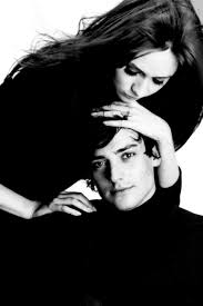
We also explored the idea of using two characters in the magazine cover such as Scott and Layla in order to promote the romantic side of the film as well as the action/thriller of the storyline. We feel that this could broaden our audience with the use of both genders.


Magazine Cover Ideas
We were experimenting with magazine covers and looked at creating our own magazine in order for it to be appropriate for our genre/film as we felt that the magazines researched were not tailored enough for our film.


We decided to take inspiration from the Little White Lies magazine cover, in particular the Drive/Ryan Gosling cover due to the similarities in character/genre of our film and Drive. We also liked the artistic/creative approach to each magazine cover but didn't like the Little White Lies logo as it takes our attention off of the image itself and the logo could be experimented with in order to suit our film and the "mainstream" magazine covers.
Tuesday 11 December 2012
Magazine research
We began by looking at a popular film magazine commenting on the conventions that it used:

There are a variety of different types of magazine covers for us to choose from, before making a decision we thought that the best starting point would be to research the types of magazines and chooses the one which would be most appropriate for our film.
Mainstream


The mainstream magazines are mainly used for large well-known blockbuster films starring well-known actors. The images used are the actors in character, including costume and props. The editors assume that the audience will know the actors which is why their names have not been placed on the magazine cover. The Empire magazine is more of a males magazine as it usually features more action films, such as 007, Batman and Captain America.
Art House


Art House magazines are usually feature films which are more creative and usually less mainstream than other films. The images used are usually just of one person- actor or director. The Little White Lies magazine cover is more minimalistic and uses an image which is more artistic, with a painterly effect which portrays the more artistic sorts of films.
Specialist Audience

Specialist magazines are focused on a particular target audience. Studio is the UK's first film magazine and the only one of its kind. This can be used when there is a specific target audience for our film, such as a female audience in terms of Studio. The images used for the magazine are mostly portraits of the actors themselves as opposed to as a character they are playing however this particular magazine cover does look classy/character like due to the positioning of the actor.
Genre


Genre Magazines focuses on a specific genre for example SFX focuses on science fiction whilst Fangoria focuses on horror films. The images used are in character including costume/make up etc. this is to make the genre evident and especially for Fangoria it is to attract the target audience, because if someone from the target audience saw a gruesome character on the cover of the magazine it may influence them into buying it.
Monday 10 December 2012

Wednesday 28 November 2012
Further inspiration


The Grey
Main actors name at the top of the page
Films title in bold under the the characters face
Tagline underneath the films title
Production details and credits in small writing
Release date
Main actors name at the top of the page
Films title in bold under the the characters face
Tagline underneath the films title
Production details and credits in small writing
Release date
Gamer
Main actors name at the top of the page
Films title in bold under the the characters face
Tagline underneath the films title
Production details and credits in small writing
Release date
Main actors name at the top of the page
Films title in bold under the the characters face
Tagline underneath the films title
Production details and credits in small writing
Release date
Wrecked
Main actors name above films title
Films title in bold under the the characters face
Production details and credits in small writing
Main actors name above films title
Films title in bold under the the characters face
Production details and credits in small writing
Tuesday 27 November 2012
Poster Influences


We are now going throught the process of researching ideas for our film poster. We thought that the main focus of our poster should be a close up of our main character Scott's face. Despite the 'Ides Of March' not being from the same genre that our trailer would be placed in, we found that this particular shot could be used in order to reflect Scott's schizophrenia. Whilst the 'In Time' poster is from a similar genre and story line as our trailer and contains the close up image of the protagonist so can be used as inspiration for our poster.
Friday 23 November 2012
Race Against Time Trailer
Voice over
We decided to create a voiceover in order to experiment with different ways of producing sound. The first is of a section of the phonecall between both Grant and Scott. The second is a voiceover of Scott that will be used throughout the teaser trailer.
We have to split the sound into different sections and edit it into our trailer, mixing it in with our music that we currently have.
Deadline day!
Today is the deadline for our final edited teaser trailer. Our trailer is currently up to scratch and we managed to complete almost everything that we had hoped to do. After a few final touches with editing and sound our trailer will finally be complete.
Below is the stop motion clip that will be included in the trailer, we wanted to use this in order to portray a sense of Scott's schizophrenia. I think that the clips work well in some aspects, however the lighting is slightly off in comparison to the other clips in which the stop motion will be placed. Hopefully we will be able to edit the lighting within this clip so that it fits in with what we already have.
We were unable to do the split screen that we had planned as when the footage was trimmed and cropped to fit the screens some of the footage was cut away, we didn't want to risk putting it into our trailer as we may get marked down for attention to framing.
Other than these few slight problems I am really pleased with the current stage of our work, the next step will be to begin thinking about film poster and magazine ideas. We have taken many photographs throughout the filming process so hopefully we will be able to use one of these images for our poster and magazine cover.
Wednesday 21 November 2012
Credit Fonts


The first text that we found was on a text website, therefore it restricted us from editing it and adding effects to it. We watched more trailers to find some inspiration and settled on the text that we used in our storyboard which is similar to the text in 'Taken', we wanted to be more creative with our credits so on livetype we added the effect of 'frigid' which shakes the text which adds to the pace of the trailer. It also reflects the character, Scott's instability.
Plan of filming
Today, me and Florence are filming some extra pieces to add to the trailer, inspired by the taken trailer we felt it would be interesting to have a triple split screen shot in our trailer. We felt this would be a good idea due to compressing a lot of action into one shot which will add to the fast pace of the trailer.
The triple split screen will consist of:
- A POV shot of Scott looking at his watch and walking over to Grant's approaching car
- The window of the car winding down
- The handing over of the money
alternatively if the shots don't flow well we can use:
- Long shot of the back of Tommy against the car
- POV shot going through the money and the window of the car winding down
- The handing over of the money
In these shots the character's faces may not be revealed to the audience to add mystery but this may confuse the audience so we will experiment with this when filming.
Character Voiceovers
One of the final things to do in terms of sound are the voiceovers, we need to record the following:
Scott:
I ran but running wasn't fast enough, love is a dangerous thing when put in the wrong hands (opening of the trailer)
Grant:
7pm sharp (during phone call)
Filming and Editing Updates

After watching through our trailer we have found that the following things are missing that we had put in initially;
1. We found that there is discontinuity between two shots where our character Scott answers the phone and in the next shot when he is dropping the phone where he has switched hands.
2. Sound - We still need to insert our protagonist Scott's voiceover as well as Grant's dialogue for the phone call.
3. The triple split screen of the exchange of money and the plan to kill Layla in which there will either be:
- A POV shot of Scott looking at his watch and walking over to Grant's approaching car
- The window of the car winding down
- The handing over of the money
alternatively if the shots don't flow well we can use:
- Long shot of the back of Tommy against the car
- POV shot going through the money and the window of the car winding down
- The handing over of the money
In these shots the character's faces may not be revealed to the audience to add mystery but this may confuse the audience so we will experiment with this when filming.
Sunday 18 November 2012
Titles and Finishing Touches
We experimented with titles and after having a play around on live type we decided on some suitable titles which match the pace of the film and genre, all that needs to be done is adding in one more shot and our music which Alexis Skitini a DJ will send to me today we will be able to add alongside another song which we feel was suitable.
Thursday 15 November 2012
Screening feedback
Today we had a screening of our trailer at the stage that it is at now, we were also given the opportunity to veiwother students work and reflect on what they have done. We were given feedback sheets of everything that they thought was good and bad about our trailer so far.
 Many people commented on the variety of shots that we used, saying that thhis was a good feature of our trailer. Somebody commented that the lighting in the tunnel was a lot darker compared to when he was on the platform. This is something that we have already disscused and we have decided that we will refilm this scene, however the scenes that are currently missing are of more of a priority to us. Most of the groups commented that the use of our titles was particularly strong and worked well with the genre and plot of the trailer. An obvious improvement suggested by all of the groups was to add sound, this is defiantly something we are working on and we aim to get this done as soon as possible.
 Many people commented on the variety of shots that we used, saying that thhis was a good feature of our trailer. Somebody commented that the lighting in the tunnel was a lot darker compared to when he was on the platform. This is something that we have already disscused and we have decided that we will refilm this scene, however the scenes that are currently missing are of more of a priority to us. Most of the groups commented that the use of our titles was particularly strong and worked well with the genre and plot of the trailer. An obvious improvement suggested by all of the groups was to add sound, this is defiantly something we are working on and we aim to get this done as soon as possible.
Subscribe to:
Posts (Atom)