Showing posts with label Juanita. Show all posts
Tuesday, 5 February 2013
Wednesday, 16 January 2013
What have you learnt from your audience feedback?
After reviewing our audience feedback we found that the audience thought that the sound throughout the trailer was most effective element. We tried to use a range of sounds in order to reflect the mood of the trailer. The trailers opening was accompanied with a very atmospheric soundtrack therefore setting the scene. We then used a sound mix as the pace of the trailer increased in order to buildup the tension.
The audience feedback chose mise-en-scene as the least effective. We tried to steer away from using too many conventional props such as weapons to try to not reveal major parts of the storyline. However, this technique seemed to be unsuccessful which shows us that maybe it would be more beneficial for us to stick to successful conventions used in other films.
How effective is the combination of your main products and ancillary texts?
After comparing and contrasting the main product with the ancillary tasks we found that the products were successful in creating synergy due to the repeated uses of the protagonist Tommy and similar fonts and layouts in order to form an association with the products and make it more recognisable.
The only technique which was not carried through was the use of dark backgrounds and colours in the trailer compared to a lighter palette used on the poster and the magazine cover, however we found that the use of white colours in the trailer would not be appropriate as it would not reflect the action genre and make the trailer appears less dark and gritty in reference to the plot.
Tuesday, 15 January 2013
Sunday, 13 January 2013
Saturday, 5 January 2013
Thursday, 20 December 2012
Final Magazine cover
Here is our final Magazine cover. Overall we are very pleased with the outcome and glad that we managed to finish the poster in time for our deadline.
Wednesday, 19 December 2012
Producing the magazine
Below I will be documenting the process of our magazine, it was a very long process but we managed to do it all in the end:
The first step was to choose our photograph and use the quick selection tool to select the image and remove it from the unwanted background.
Before placing the image we first had to choose the background that we wanted. We chose a brick background in order to give it a rough feel. We then edited the background with a cartoon, artistic feel similar to the ones seen on Little White Lies. We also added an effect to the image of Tommy before we placed it onto the background.
We then added the title 'Motion.' We used the effects button in order to play around with the drop shadow and outer glow of the text.
We added in the bar-code and circle design similarly to the Little White Lies using the shape tool. Then we made the text smaller so that they could fit together.
We then added in the rest of the text making sure to stick to magazine conventions that we have already looked at.
We did a sight test of the magazine to see if all the text was distinguishable from far away. We realised that it wasn't so we had to change the colour of the text. we also changed the size of the bar-code as it was far too large in comparison to the magazine title, causing it to take attention away from it.
Discussing Magazine Ideas
After researching different types of magazines and different genres we realised that we didn't think that any of the magazines that we had researched were particularly suited to our film, this meant that we wouldn't use any currently existing magazines, instead we would produce our own.
However we really liked the artistic element portrayed in the Little White Lies magazine.


We decided that the best idea would be to create our own magazine featuring particular elements from the Little White Lies magazine cover and also incorporating our own. The magazine that we would produce would be a hybrid magazine and it would feature films with all different types of genres.
Photo options
Rather than taking completely new photographs we decided to use some of the photographs that we had already taken during filming. This decision will allow us with more time when we begin to produce the poster. Below are the options that we thought would be most appropriate for our idea out of the images that we already had.
After much discussion we all finally agreed on an image that we all liked and thought would be best for our magazine cover:
Magazine Title Results
The poll is closed and the results are in!
There is a clear winner taking 53% of the votes...
Motion
Thursday, 13 December 2012
Magazine title ideas...
We decided to begin coming up with ideas for the title of our magazine . We started by looking at different words that would be associated with the genre of our film. We looked on the thesaurus and started brainstorming words that we found from that website.
Tuesday, 11 December 2012
Magazine research
We began by looking at a popular film magazine commenting on the conventions that it used:
There are a variety of different types of magazine covers for us to choose from, before making a decision we thought that the best starting point would be to research the types of magazines and chooses the one which would be most appropriate for our film.
Mainstream
The mainstream magazines are mainly used for large well-known blockbuster films starring well-known actors. The images used are the actors in character, including costume and props. The editors assume that the audience will know the actors which is why their names have not been placed on the magazine cover. The Empire magazine is more of a males magazine as it usually features more action films, such as 007, Batman and Captain America.
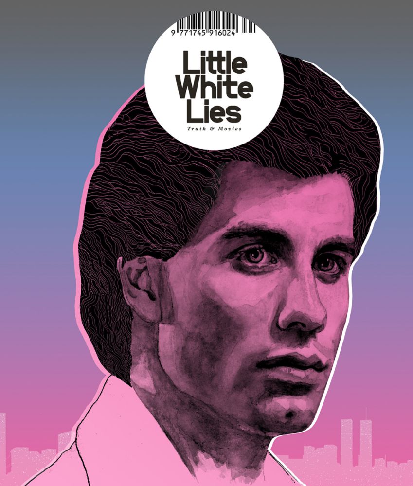
Art House
Art House magazines are usually feature films which are more creative and usually less mainstream than other films. The images used are usually just of one person- actor or director. The Little White Lies magazine cover is more minimalistic and uses an image which is more artistic, with a painterly effect which portrays the more artistic sorts of films.
Specialist Audience
Specialist magazines are focused on a particular target audience. Studio is the UK's first film magazine and the only one of its kind. This can be used when there is a specific target audience for our film, such as a female audience in terms of Studio. The images used for the magazine are mostly portraits of the actors themselves as opposed to as a character they are playing however this particular magazine cover does look classy/character like due to the positioning of the actor.
Genre
Genre Magazines focuses on a specific genre for example SFX focuses on science fiction whilst Fangoria focuses on horror films. The images used are in character including costume/make up etc. this is to make the genre evident and especially for Fangoria it is to attract the target audience, because if someone from the target audience saw a gruesome character on the cover of the magazine it may influence them into buying it.
Monday, 10 December 2012
Wednesday, 28 November 2012
Further inspiration
The Grey
Main actors name at the top of the page
Films title in bold under the the characters face
Tagline underneath the films title
Production details and credits in small writing
Release date
Main actors name at the top of the page
Films title in bold under the the characters face
Tagline underneath the films title
Production details and credits in small writing
Release date
Gamer
Main actors name at the top of the page
Films title in bold under the the characters face
Tagline underneath the films title
Production details and credits in small writing
Release date
Main actors name at the top of the page
Films title in bold under the the characters face
Tagline underneath the films title
Production details and credits in small writing
Release date
Wrecked
Main actors name above films title
Films title in bold under the the characters face
Production details and credits in small writing
Main actors name above films title
Films title in bold under the the characters face
Production details and credits in small writing
Tuesday, 27 November 2012
Poster Influences
We are now going throught the process of researching ideas for our film poster. We thought that the main focus of our poster should be a close up of our main character Scott's face. Despite the 'Ides Of March' not being from the same genre that our trailer would be placed in, we found that this particular shot could be used in order to reflect Scott's schizophrenia. Whilst the 'In Time' poster is from a similar genre and story line as our trailer and contains the close up image of the protagonist so can be used as inspiration for our poster.
Friday, 23 November 2012
Race Against Time Trailer
Subscribe to:
Posts (Atom)